1. Problem:
When shopping for a used vehicle, typically an overriding concern is: Am I paying too much? This question is often difficult to answer due to the fact that it's hard to keep track of all the vehicles of interest currently available on the market.
A second, and related concern, is: Which vehicles with similar specifications are available? This information can help the buyer get a feel for what else is available on the market and provide an indication of the value of the vehicle currently under consideration.
2. Goal:
This project has two goals. The first is to build a model that determines if the asking price for a particular car is reasonable given the information provided in the listing. Additionally, the code will provide recommendations for related vehicles with a lower price, lower miles, and one that is slightly more expensive.
3. Data:
The data were obtained by scraping http://www.cars.com with the following limitations:
- Only used cars with photos
- Model years between 2005-2016
- Vehicles located within 75 miles of San Francisco, CA or San Diego, CA
- Minimum price $5000
After obtaining and filtering the data, the final dataset contains:
- 44745 unique listings
- 52 Makes
- 730 Models
- 1521 Trim Names
- 225k photos
Figure 3.1 Number of Listings Per Model Year. Nearly 50% of the listing are contained in model years 2013, 2014, and 2015.

Figure 3.2 Price Distribution per Model Year. This plot is limited to a maximum price of $150,000. As expected, there is a general trend of prices increasing as the age of the vehicles decreases. However, there is a wide spread of prices within each year.

Figure 3.2 Price Distribution per Make. As above, this plot is limited to a maximum price of $150,000. This plot demonstrates that several makes have extremely large variations in their pricing, while others have smaller ranges. An example of further breaking down the prices for each make by year is shown in Figure 3.3.

Figure 3.3 Price Distribution per Make per Year. For clarity, this plot is limited Chevrolet, Jeep, and Porsche, with a maximum price of $150,000. From this plot, we can see that the degree of price change over time varies significantly between makes.

4. Modeling
4.1 Bayesian Linear Regression
In order to determine if a vehicle is a good value or not, I will use linear regression to predict the price distribution for each combination of year, make, and model, and then compare it to the actual price. If they are similar, then it is 'reasonable,' otherwise, the shopper may want to investigate why the vehicle is priced too high or low vs the prediction.
This problem is ideally suited Bayesian methods, specifically to using a hierarchical model. Due to the large amounts of variability within the data down to a level of trim, a traditional linear regression would likely have trouble producing reasonable predictions, even if the regression was done independently for each year, make, and model. Limiting it further by trim levels would negatively impact the performance due to potentially small sample sizes.
To get around this issue, I use a Bayes hierarchical model that predicts a price given the miles of a vehicle taking into account known information about prices based on year, make, model and trim. This gives a distribution of estimated prices (posterior probabilities), against which the original asking price can be compared.
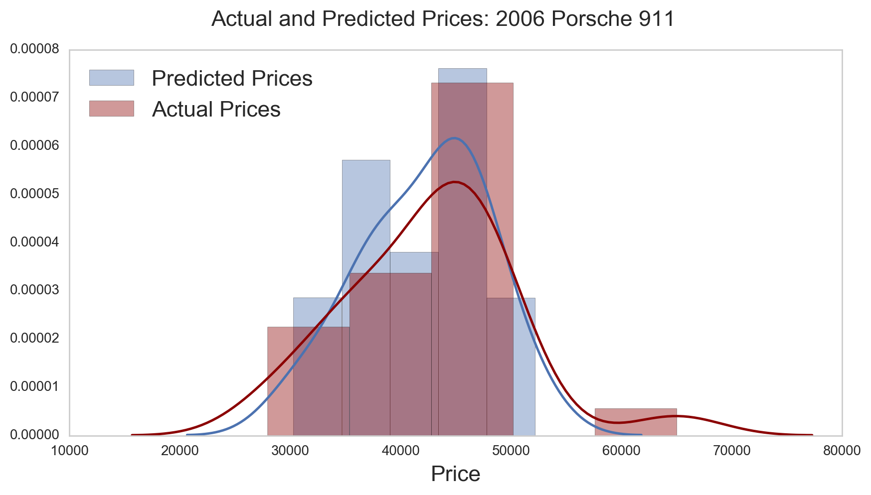
Figure 4.1.1 Price Distributions: Predicted vs Actual. One way to check the quality of the model fit is to compare the distributions of the predictions and the actual values. In this subset of data, we can see that the model does a good job of predicting the overall prices.
Once we have the price distribution for the combinations of Year, Make, and Model, we can extract the price distribution for each trim level as shown in Figure 4.1.2. The highest point of the distribution is the price the model considers the most likely to occur.
The shape of the distribution is itself informative. A narrow distribution indicates that there is more confidence in the predicted price. The 'credible interval' describes the prices that lie within 95% of the mean. A wider distribution indicates that there is limited data for the trim level within the year-make-model combination, and the prior information built into the model will have a large influence on the price distribution.
Figure 4.1.2 Price Distribution for Single Model.
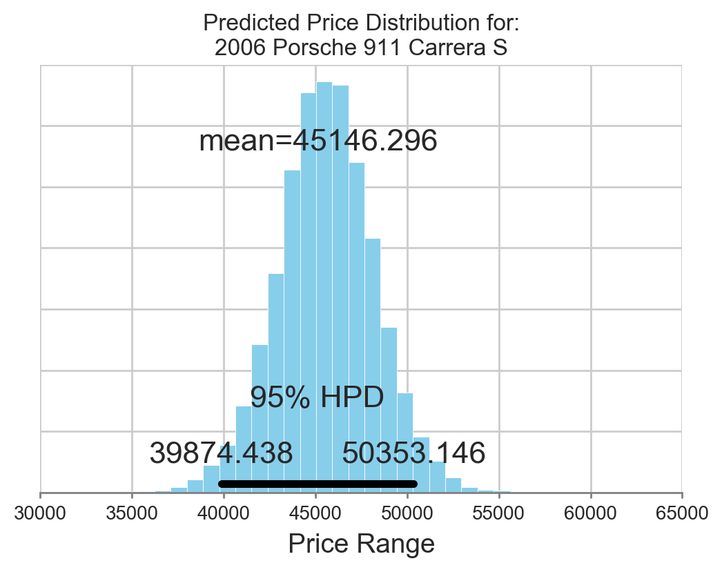
Figure 4.1.3 Price Distribution Examples. The top part of each plot is the predicted price distribution displayed as a kernel density plot, with the price of the vehicle of interest shown as a red star. The bottom portion is a scatterplot of price vs miles. The main vehicle is again shown with a red star, and vehicles with the same year-make-model-trim combination are shown as blue stars.
This plot serves two functions. 1. It shows the predicted price (as a distribution) vs the actual price for the specific vehicle. If the star is far from the center, then it is worth investigating why the actual price is deviating so far from the predicted price. 2. The scatterplot shows how many data points were used in the prediction, as well as information about their price and miles. 3. Both plots share the same price values on the x-axis.
A. In this case, the predicted price and actual price line up nearly perfectly. For this vehicle, the price seems to correlate very well with miles. B. With many data points, the model is quite confident in predicting the average price for this vehicle. However, the actual price is much higher than predicted, despite the miles being at the higher range of related vehicles. This suggests further investigation into the pricing would be advisable. C. In a case where there isn't much data, the model does not have much confidence in its prediction. The actual and predicted prices are not identical due to the influence of any other trim levels having the same year-make-model.
A B
B C
C
4.2 Recommendation Engine
For the recommendation engine, I will build a content-based model that is trained on the descriptive features available for each vehicle. Using that, it will be possible to predict which vehicles are most similar to each other, and that information can be returned to the user.
To do this, I will create a sentence that describes each vehicle, composed of the following parts:

From there, I will break the sentence down using the 'term frequency–inverse document frequency' method. This will return the proportion that each word appears in the overall collection of sentences, with the value weighted by its frequency. N-gram values of 1 through 4 are used (one, two, three, and four-word phrases), as that ensures that the vehicles with the same 'year make model trim' will be ranked as highly similar to each other, with further separation provided by the other descriptors. Finally, the similarity ranking for each listing is calculated against all other listings. Then the rankings are then sorted by similarity and used to do things such as finding a related vehicle with a lower price, as shown below.
Once the similarities are calculated, return listings related to the original ad based on these criteria: 1. Return a similar model with a lower price 2. Return a similar model with lower miles 3. Return a similar model with a higher price
Figure 4.2.1 Recommendations.

The plot below has several components, and I will go through each of them in general before discussing the models specifically.
- The title provides the basic info about the vehicle that is being researched.
- The right-side square of photos compares the parent listing against similar vehicles having a lower price, lower miles, and one that is up to 25% more expensive.
- The upper-left plot shows the results from the regression. This is the price probability distribution for the specific year, make, and model vehicle, and was calculated with a hierarchical model that accounts for different trim levels. The star represents where the parent listing falls on the distribution. A narrow distribution implies that there were many data points and that the confidence of the average price for that make-model-year-trim combination is high. This is another way of saying that the credible interval is small. A broad curve indicates that there is more uncertainty in the predicted price. The basic idea here is that if the parent vehicle is not near the predicted average price, then the user should try to understand the discrepancy (i.e., low/high miles).
- The lower-left plot is a scatterplot showing the price and miles for each vehicle in the dataset with the same make-model-year-trim combination. As in plot 3, the red start highlights the position of the parent listing.
Figure 5.1 Combined Price Distribution and Recommendation.

6. Final Thoughts
Like most data science problems, this work would have undoubtedly benefitted from cleaner (and more) data. While the details provided in the downloaded listings are quite comprehensive, I was only able to include a small number of the features. And some features, especially trimName, were very unreliable. Many of the trim names had multiple variations of the same name, and some had complete nonsense like 'lease this car now!'. I was not able to develop code capable of cleaning up the discrepancies between the various names, and I suspect this had a negative impact on both the regression and recommendation calculations.
There was an additional data set available at fueleconomy.gov that contains even more information about specific models. I wasn't able to combine this with my dataset, again in large part due to the issues with trimName. Including that data would provide many more features that would especially enhance the content-based recommendation.
Future Work:
- Include additional description in the price distribution plot to indicate the reasonableness of the price
- Look more in-depth at pricing strategies between different dealers, regions, seasons, etc
- Investigate more thoroughly the factors that go into pricing. While this model only considered miles and trim, there are many other factors that can be used
- Exterior and interior color
- Engine, transmission, drive type
- Cost to own (based on EPA information)
- Collect data over time and predict price trends for each vehicle
- How fast will it depreciate?
- What determines the rate of depreciation?
- Build in a way to make the output attractive and interactive